
Dec 2023 — Nov 2025 · Project Manager & Lead Product Designer
Woodball Vista — Tournament Information System
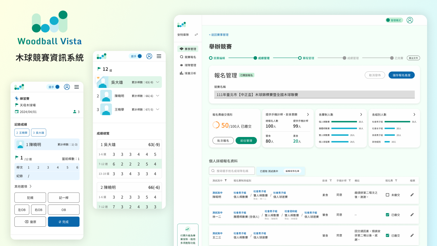
A woodball tournament information platform that unifies registration management, scheduling, score tracking and player records in one place, built to support the full flow of large open championships.
Summary
On this project I took over a woodball tournament management system that was roughly 25% complete, moving from lead product designer to also serving as project manager. I transformed a traditional, heavily paper-based tournament workflow into a digital platform serving two roles — “player” and “administrator” — and carried it through 15+ real tournaments of iteration.
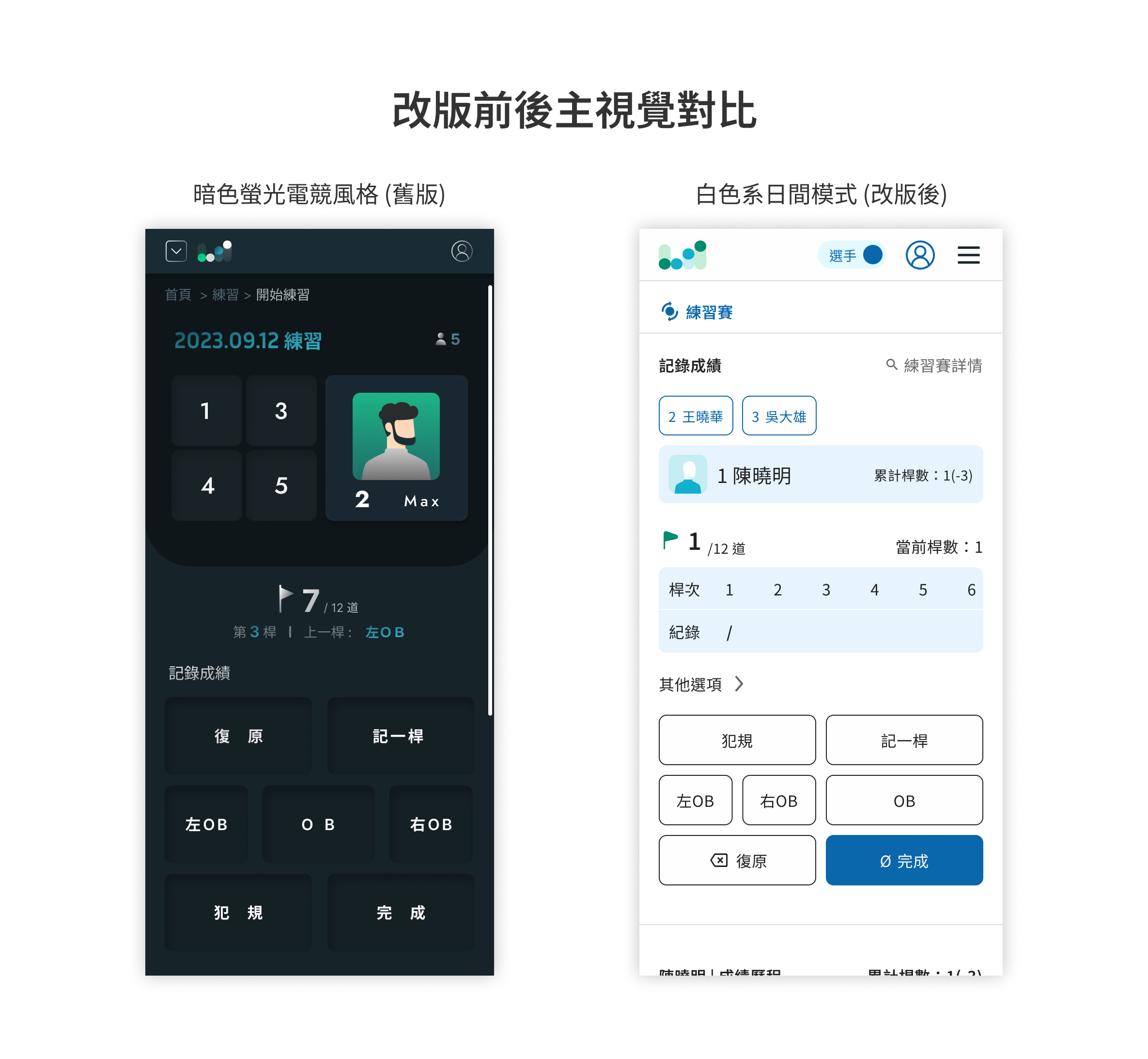
On the design side, I rebuilt the entire design system and the core user flows. I started from the target users (middle-aged and older players, and older team managers) and the realities of running a tournament. First I shifted the old dark, neon, e-sports-style key visual to a light, daytime visual mode. Then I restructured the operational flow for hosting a competition and replaced the long, sprawling scheduling table with a calendar interface. Finally, after introducing the electronic scoring mechanism, observing the on-site workflow let me identify the key problem: the real bottleneck in check-in wasn’t that people couldn’t find the QR code — it was that there were too few check-in stations. I then proposed the solution and its design.
On the project management side, I faced a vicious cycle: “customized tournament-format requests keep coming in → design and development timelines get compressed → the post-launch rate of unexpected errors stays high.” I helped the team break out of it by “assessing whether each requirement was truly necessary, defining priorities, rolling things out in phases, and turning tournament information into a predictable schedule ahead of time.” This experience was also what formally moved me from designer into a PM role.
Project outcomes:
- The system has cumulatively supported 15+ official tournaments, 10+ teams, and 200+ players in a single event
- In practice it cut tournament preparation from 1 week to under 1 day, and score calculation and ranking publication from 1 hour to real-time updates
- Awarded a Republic of China utility model patent, on which I am listed as a co-inventor.
Read on for the project details ↓
Project Background
Traditional woodball tournaments rely heavily on paper — scorecards, schedules, and results announcements are all on paper. This creates three long-standing pain points:
- Organizers spend a long time preparing tournaments
- Scores and rankings are frequently delayed during a competition
- Paper is hard to use outdoors in bad weather
When I took over the project, the previous designer had already left while the system was around 25% complete, and the version they left behind had a few clear problems:
- The interface used a dark, neon, e-sports style that was clearly bad for the legibility needs of the target users: middle-aged and older players, older team managers, and players competing outdoors
- The key operational flow for hosting a competition got stuck, with sub-steps scattered across multiple separate pages.
My job was to redefine the product’s entire design system and user flow from this half-finished state, and to keep building out the features still left to design.
My Role Gave Me Two Perspectives
I took this on as a UI/UX designer and later also served as project manager, owning the project’s full UX flow and UI design, and leading the introduction, testing, and launch of new mechanisms like electronic scoring.
The thing that best represents my value on this project: I used a designer’s eye to judge “is the product well designed and usable,” and a PM’s eye to judge “is each requirement worth doing now, and how will doing it affect the product and the team’s operations.”
These two perspectives actually share the same approach: break down the flow first, find the real bottleneck, then decide how to act. On the interface, it helped me find where users were actually getting stuck; on the project, it helped me judge which requirements were core and which could be deferred. Below I explain across two dimensions — “design decisions” and “project management.”
Design Decisions: Working Back to the Interface from the Usage Context
When I design, I usually confirm “who is using it, in what context” first, then work backward to what the interface should look like.
Woodball’s main audience is middle-aged and older players, the people running tournaments are mostly older team managers, and features like practice-match scoring and looking up results are used on outdoor courts during the day.
As in the example at the very start, this usage context directly overturned the previous designer’s direction: a dark, neon, e-sports style is nearly unreadable under bright sun. I rebuilt the entire key visual from scratch into a light, daytime mode. This wasn’t an aesthetic preference — it was a legibility decision derived from analyzing the actual target users’ characteristics and usage context.
1. Hosting flow: converging “sub-steps scattered across pages” into “linear without losing your sense of place”
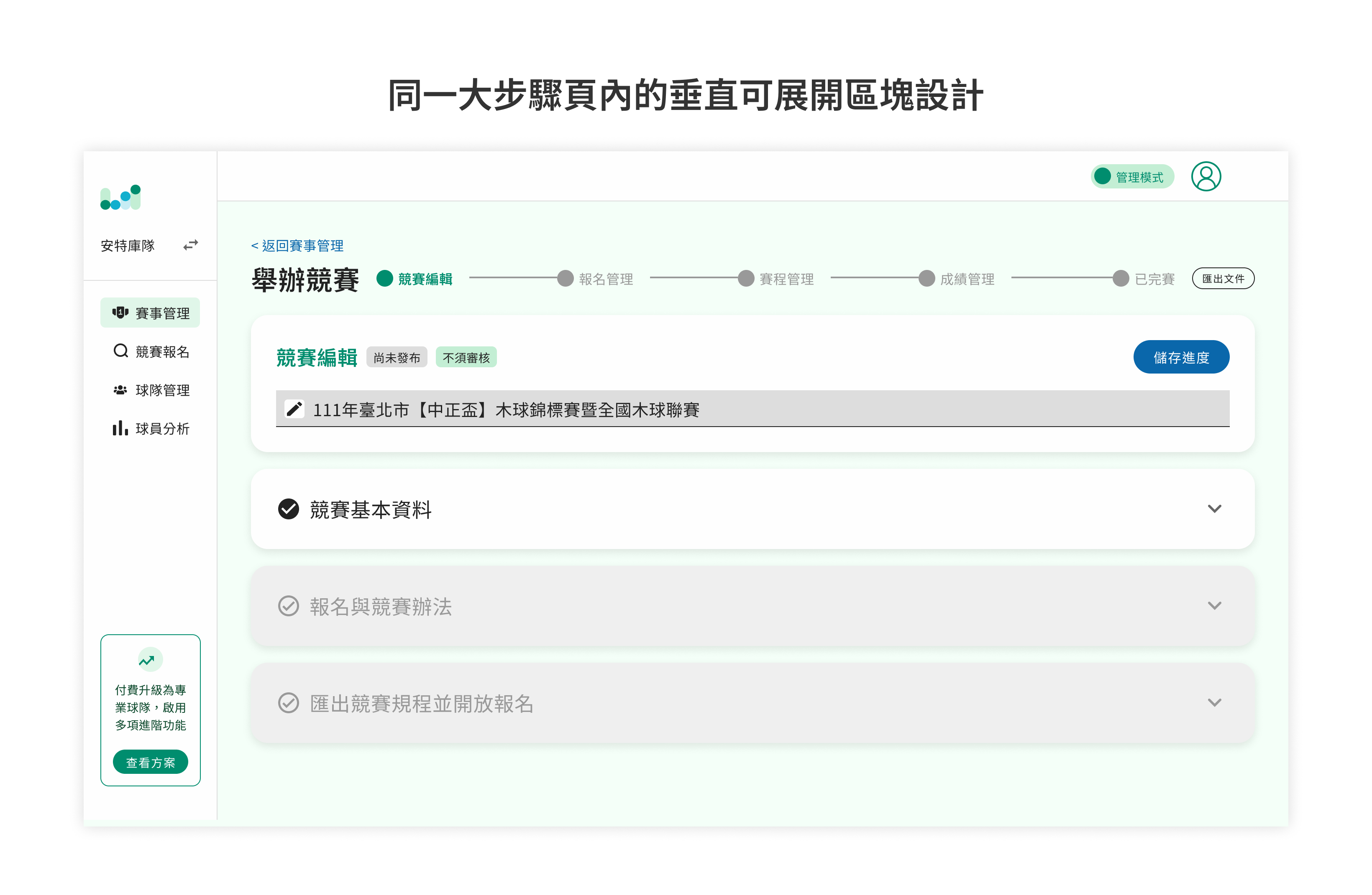
When I took over, the hosting feature already had a fairly complete “four major steps” structure: edit information, manage registration, arrange scheduling, manage scores. The problem was that each major step had many sub-steps beneath it, and each sub-step was its own separate page, strung together with “previous / next” buttons.
I judged the risk in this structure to be: hosting a tournament is an operation that requires repeatedly cross-checking information between steps (for example, going back to verify the registration list while arranging the schedule), and separate pages make users lose their bearings within the hierarchy of major steps and sub-steps — not knowing where they are or how much is left.
My approach was to turn the originally separate sub-step pages into vertically expandable / collapsible sections, arranged in order within a single major-step page. This way each major step maps to exactly one page, and users can complete each sub-section’s settings in order without leaving the current page, seeing their overall progress at all times.
For the complex operations inside a sub-section (e.g. batch registration, fine-grained schedule arrangement), I used pop-up windows, which likewise avoids forcing the user to switch to another separate step and lose their place.
The core of this trade-off is: finding the balance between “clear steps” and “not losing the big picture.” Flattening everything into one long page makes it hard to find the key points; splitting everything into many pages makes you lose your way. Vertical sections are the solution between the two.
2. Registration management: merging the two-stage “enter first, then group” flow into one
The original registration management was staged: first enter the player roster, then go through the whole batch of players one by one to find the right person and assign them to each group. Once the number of players grew, “finding the person to group among many people” became time-consuming and error-prone.
My redesign direction was simple — move the grouping decision forward to the moment of entry. As users enter the roster, they can directly choose which group that player will compete in, eliminating the entire after-the-fact process of cross-referencing players against groups.
This decision looks small, but it reflects how I look at flows: rather than optimizing the action of “searching within a large amount of data,” it’s better to directly eliminate the need to search at all.
3. Scheduling: replacing the long schedule table with a familiar “calendar”
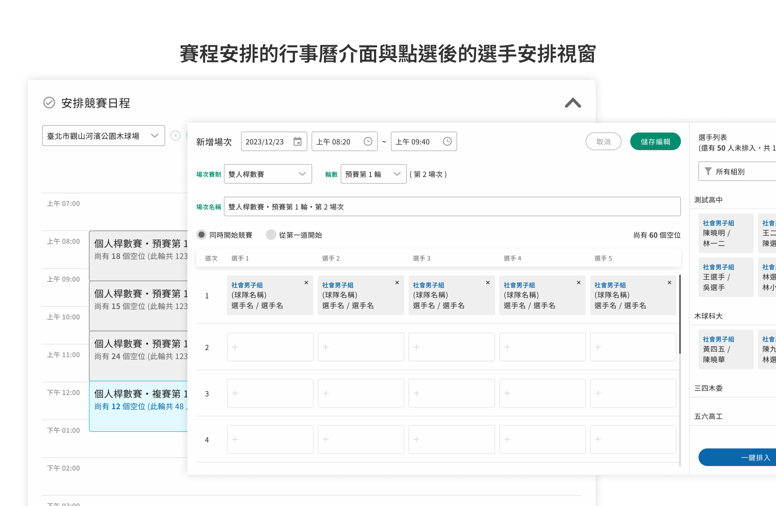
The old scheduling approach listed player schedules row by row directly on the page, which was extremely long; meanwhile the player roster stayed fixed on the side of the screen for drag-and-drop. The result was an overly cluttered screen, and all the related operation options were scattered around and disconnected from one another. Users couldn’t complete setup in a natural logical order — they had to hunt all over the scattered interface for the options they needed.
I introduced a calendar interface that users were already familiar with to replace the row-by-row schedule table. The originally long schedule became individual blocks on a timeline, so you can see the order and length of matches at a glance; only after clicking a block does a window open for player arrangement, avoiding cramming all the information onto the screen from the start.
More importantly, the guided order inside the window — I have users select in the order “time → group → competition stage,” and only after everything is selected does the corresponding player roster appear for arrangement. This order isn’t arbitrary; it mirrors the order actually used in woodball scheduling in practice, so the sequence in which options appear matches the decision logic already in the user’s head. Guided by the interface, users can complete the arrangement intuitively in a sensible order.
The calendar is one of my most satisfying decisions on this project, because it solved three things at once: lowering the learning cost (reusing a familiar mental model), converging the on-screen information (key points first, details later), and making the operation order intuitive.
4. Electronic scoring & check-in: finding the “real bottleneck” instead of optimizing the wrong place
After regular scoring had run stably for a year, we began trying to introduce electronic scoring into official competitions. The scoring interface was deliberately kept consistent with the interface players use in regular practice matches, so apart from scanning a QR code to log in before the match starts, there was almost no learning cost. Yet after launch the biggest problem actually appeared at the check-in stage.
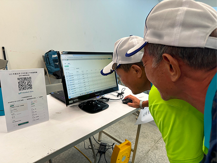
During check-in, scoring staff need to go to the registration desk to scan the QR code on the scoring card the organizer provides, but on-site there were usually only 1–2 computers that could do the scanning, opening one card at a time for people to scan — which severely lengthened check-in time.
I didn’t rush to adjust the existing interface. Instead, I first went back to understand “how check-in worked back in the paper era.” I found that in the past they printed paper scoring cards, verified the name, and handed them out directly — unconstrained by the number of machines — and that there were actually “multiple” staff on-site helping with check-in. It was only after digitization that everyone was forced to crowd around those 1–2 machines, so the staffing was effectively bottlenecked by the number of machines.
In other words, the bottleneck wasn’t “can’t find the QR code” — it was “too few devices able to scan.” Once that was clear, I also ruled out an intuitive but wrong option — laying out all the QR codes on screen at once, which would only create new searching and mis-scanning problems.
The final solution was to design a mobile check-in page: check-in staff log into the backend on their own phones, choose the competition they have permission to help with, open the check-in roster directly, and with keyword search, just type the player’s name to find the corresponding electronic scoring-card QR code, presenting it on the phone screen for the player to scan. This effectively expanded the “check-in devices” from 1–2 machines to “the phone of every staff member on-site,” putting to use the staffing that already existed but had been left idle by the limited number of machines.
Project Management: Balancing Client Requirements Against Development Timelines
Design was only half of this project. As the system was adopted into more and more real tournaments, the bigger challenge was actually at the project-management level.
Breaking the “requirement → compressed timeline → launch errors” vicious cycle
Woodball rules still aren’t standardized; local tournament organizations often have their own rules for running events, so they constantly proposed customization requests for more flexible scoring methods and format settings. Early on, before I was involved in project management, I’d try to adjust the design to satisfy each such request, and supervisors often required new mechanisms to be introduced for tournaments that were very close at hand. The result was that design, development, and testing time were all relatively rushed, and unexpected errors kept appearing after launch. The team fell into a cycle: new requirement comes in → timeline gets compressed → insufficient development and testing → handling errors after launch → chased by the next requirement.
After communicating repeatedly with my supervisor and the team, I established three mechanisms to break out of this cycle:
- Assess requirement necessity at the source: before designing, evaluate together whether each new requirement absolutely must be met, or whether there’s a compromise — rather than accepting everything unconditionally.
- Define priorities and roll out in phases: rank requirements by importance and introduce them in batches, converging the goal of each iteration so a single round’s scope doesn’t expand infinitely.
- Turn uncertain requirements into a predictable schedule: I realized that tournament dates, formats, and headcounts could actually be asked of the organizer in advance, so I proactively asked my supervisor to provide the date, format, and headcount for every tournament in the next six months, letting me reserve more buffer for testing-and-launch timelines based on the concrete competition schedule.
After this approach was put in place, the team broke out of the vicious cycle, and subsequent launches of new mechanisms went far more smoothly than before. It was precisely because I’d long helped my supervisor communicate requirement priorities and scheduling that I formally moved from designer to also serving as PM.
Cross-functional collaboration
Wearing both design and PM hats, I was responsible for coordinating the rhythm across design, development, and testing, and aligning with my supervisor before each iteration on “the core problem this version should solve.” I have basic front-end and back-end development knowledge, so I could assess technical feasibility and development difficulty during planning and turn requirements into reasonable timelines the development team could actually handle — rather than simply handing over what I thought was the ideal design without discussing its feasibility with the developers.
Outcomes
After the competition-management features launched, the system was adopted across roughly 15+ official local woodball tournaments in Taiwan within 2 years — each with around 100 participating players, up to 200+ at most — and it continued to absorb user feedback for adjustments. Measured benefits:
- Tournament preparation and registration setup: from 1–2 weeks to under 1 day
- Score-tabulation staffing: from 2–4 people in the paper era down to 1 person entering into the system with rankings auto-calculated; after on-court electronic scoring was introduced, the staffing for tabulation approached zero
- Award-ceremony wait time: because scores are auto-calculated, from waiting 1–3 hours down to awarding within 10 minutes of score entry being finished
- Paper usage: from hundreds of sheets per event down to dozens
The real-time scoring and live ranking-rotation features were first used at a local beach woodball competition the company organized itself. They earned recognition from national- and local-level woodball associations, local government, and sponsors, secured the opportunity to become an officially certified local tournament, and won approval to co-organize again the following year.
In addition, this system was awarded a Republic of China utility model patent, on which I am listed as a co-inventor.
Reflection
This project confirmed two things for me. On design, good decisions often aren’t in the interface, but in the depth of understanding the usage context: had I rushed the interface for the check-in stage, I might well have built something like “lay out all the QR codes” that worsens the problem.
On project management, what actually solves the problem isn’t working harder to rush, but changing the way requirements are solved: turning uncontrollable client requirements into a predictable, phaseable schedule.
If I did it again, I’d schedule “on-site field observation” into the design process earlier, and establish a requirement-assessment mechanism within the team sooner — rather than only starting to communicate once the vicious cycle was already chasing me.