
Apr 2023 — Jul 2023 · UX Researcher & UI Designer
KnowQuest — Online Review Platform UX Design
Designing an online multi-faceted review platform for a Canadian startup, starting from user research to redefine the search flow, design a staged rating mechanism and a reward system, raising users' willingness to rate and creating business-partnership opportunities.
Summary
This was the last industry-academia collaboration project of my master’s at Northeastern University in the US, in partnership with the Canadian startup KnowQuest, doing UX research and UI design for the online multi-faceted review platform they were developing.
KnowQuest’s core distinction is that it asks consumers to rate “multiple facets” of a product (rather than giving just one overall star rating), but this also left the platform facing a fundamental contradiction: the more rating facets there are, the more cumbersome the flow, and the more likely users are to give up partway. On top of that, the platform lacked an effective incentive mechanism at the time, and usage wasn’t high enough to support their downstream B2B data-service business model.
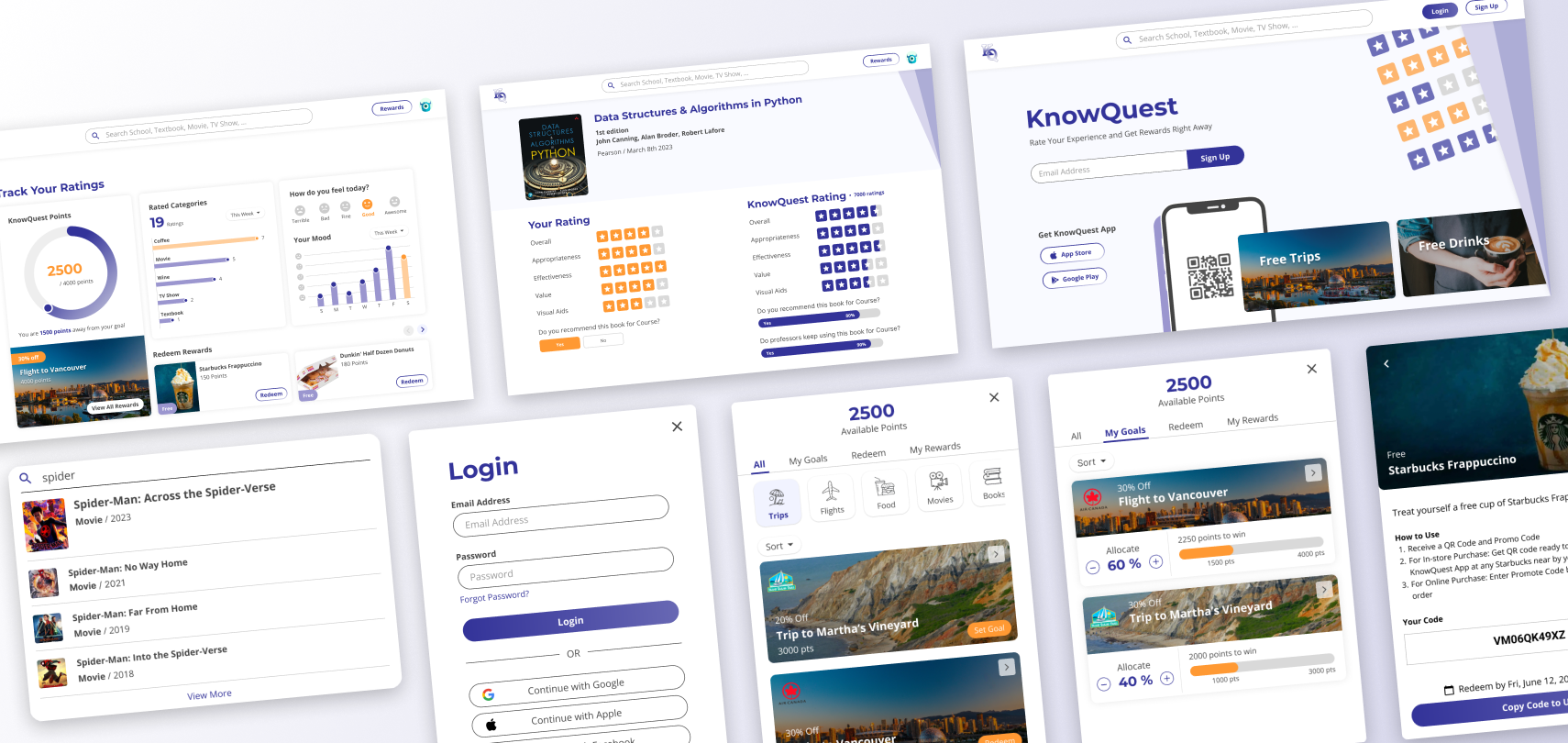
I was responsible for user research, product system planning, and the wireframe and prototype design of the desktop website. A few key design decisions included: replacing category navigation with keyword search (because users come “with a specific product to rate,” not to browse), splitting the multi-faceted rating into a staged flow paired with instant rewards to prevent fatigue-driven dropout, and designing a complete points-and-rewards dashboard to build long-term motivation to use the platform.
Project outcomes:
- Delivered a user-research report and product system-planning diagrams, serving as the basis for the company’s subsequent development
- Delivered hi-fi wireframes and an interactive prototype of the desktop web MVP
- The proposed reward system created business-partnership opportunities for KnowQuest
Read on for the project details ↓
Project Background
KnowQuest is a Canadian startup that began in the academic space (rating university textbooks) and gradually expanded into consumer categories like movies, food, and games. Their biggest difference from other review platforms: they ask consumers to rate multiple facets of a product separately, rather than giving just one overall score, in order to produce review data with more analytical value.
Their long-term business model is to package the collected multi-faceted rating data into a B2B data-analytics service to sell to enterprise clients. But the problem was: the platform’s consumer-side usage wasn’t yet high enough to collect sufficient rating data to support the B2B service. So before launching B2B, they first needed to make the consumer-side platform more usable and more appealing.
After a kickoff meeting with KnowQuest’s CEO, we confirmed the project direction: solve the consumer-side experience problems first, so more people are willing to come and rate, which then provides the data to support the downstream B2B business model.
My Role
In a two-person design team, I was responsible for user research, product problem definition, and the complete UI design of the desktop website (the other designer handled the mobile app). The whole project was conducted under the supervision of our advising professor, with regular progress reports to KnowQuest’s CEO to validate the design direction.
What this project meant to me: it was the first time I fully experienced the process of “deriving design decisions from research insights,” rather than jumping straight into screen design. Several of the most critical design decisions only surfaced during the research phase — which also shaped my later habit at work of always insisting on “understanding the context before starting to design.”
Research Findings: Defining Three Core Problems
Through secondary-data research, surveys, and competitive analysis (Google, Amazon, Yelp), we distilled three key findings affecting users’ willingness to rate:
1. Consumers rely on reviews to make purchase decisions, but rarely review proactively themselves. Most people are “review readers” rather than “review writers,” lacking enough motivation to go from consumer to reviewer.
2. Rewards effectively raise willingness to rate. Discounts, loyalty points, and early-access eligibility for new products are all incentives that make consumers willing to spend time rating.
3. A flow that’s too long directly leads to dropout. When the review process exceeds a certain length, completion rates drop significantly — a structural risk for KnowQuest’s multi-faceted rating model.
These three findings ultimately converged into a single brand principle, which became the benchmark for all subsequent design decisions:
“Rate on KnowQuest — fast, simple, and worth it.”
Design Decisions: Making “Rating” Something Worth Doing
1. Replacing category navigation with keyword search — because users aren’t here to “browse”
This was the earliest and most critical directional decision in the project.
Our initial instinct was to design a dropdown category menu in the navigation bar, similar to how e-commerce sites let users browse products by category — a common pattern on most platforms, and one that fits the average consumer’s mental model. But during the system-planning discussions, we realized KnowQuest’s usage context is completely different from e-commerce: users don’t come here “to browse others’ reviews and then decide what to buy,” but “having used a specific product, they want to quickly find it and leave a rating.”
In other words, users arrive with a clear goal — what they need is “direct access,” not “exploration.” Category navigation actually slows them down, because it assumes users need to be guided to find things, when in fact they already know what they’re looking for.
So I changed the primary search method to a keyword search bar, fixed in the navigation bar for use at any time; entering a keyword directly produces a results list with category tags right below the search bar, with no need to jump to a separate search page. This decision may look like just swapping a UI component, but behind it is a re-judgment of the usage context: for the same function (finding a product), under different usage motivations, the best interaction is completely different.
2. A staged rating flow — using a reward rhythm to counter the fatigue of multi-faceted rating
KnowQuest’s core value is multi-faceted rating, but this is also its biggest experience risk: the moment there are many questions, users get fatigued and quit. And we experienced this problem firsthand in our survey design — our initially designed survey was so long that about 40% of respondents didn’t complete it.
This experience directly inspired the design of the product’s rating page. My approach was to split the rating questions into multiple stages, each with no more than 7 questions, awarding reward points immediately upon completing each stage, with an extra bonus for completing them all.
The core logic of the design: rather than expecting users to answer all the questions in one go, it’s better to let them feel a sense of “completion” and “reward” at each segment. Even if a user finishes only the first stage and leaves, KnowQuest has still collected some valuable rating data; and the continuously awarded rewards plus the final bonus encourage them to complete as much of the rating as possible.
In the page layout, I presented the product information and the rating form together on a single screen, with no scrolling needed, so users can scan quickly and focus on the rating itself.
3. A rewards dashboard — making “the payoff of rating” visible and manageable
Research clearly showed that rewards drive rating behavior, but simply “giving points” isn’t enough — users need to clearly see how much they’ve accumulated, what they can redeem, and how far they are from the next goal.
I designed a dashboard interface on the post-login home page, integrating three core functions:
Points visualization and goal management — users can browse redeemable rewards, set a desired reward as a goal, and allocate points to different goals by importance, giving the accumulation process a sense of direction rather than being aimless. I divided rewards into two types: small rewards redeemable with a few points let users feel the payoff quickly; big rewards requiring long-term accumulation sustain the motivation to keep using the platform.
Rating history — users can review their past rating records, and even go back to adjust them, so rating isn’t a one-off action that’s “handed in and forgotten.”
Product recommendation list — recommends not-yet-rated products based on the user’s purchase history, shortening the path of “wanting to rate but too lazy to search.”
This dashboard’s design served both the user experience and the business goals at once: for users, it turns “continued rating” into a behavior with goals and payoffs; for KnowQuest, the reward system requires enterprise partnerships to provide, which directly created the business opportunity for B2B partnerships.
4. Not introducing text reviews — a deliberate choice that went against the research findings
This was the most tension-filled decision in the project. Our research clearly showed that consumers trust text reviews more than star ratings alone; by the research findings, introducing text reviews was a reasonable direction.
But we ultimately decided not to add them.
The reason goes back to KnowQuest’s product positioning: it set out to be a “rating platform,” not a “review platform.” We wanted users to come proactively to rate after consuming, not to come before consuming to consult reviews. Introducing text reviews would not only lengthen the rating flow (precisely against our core principle of “fast and simple”) but also blur KnowQuest’s differentiated positioning relative to mature platforms like Google Reviews and Yelp.
This decision taught me one thing: research findings tell you “what users value,” but they don’t directly tell you “whether your product should do this thing.” Design decisions need to consider user needs, product positioning, and business strategy at the same time — sometimes the best judgment is to deliberately not do something.
Outcomes
- Delivered a user-research report and product system-planning diagrams, providing the basis for KnowQuest’s subsequent development phases
- Delivered the desktop web MVP’s hi-fi wireframes and an interactive prototype, covering the full flows of search, rating, reward management, and landing page
- The proposed reward system not only solved the problem of users’ willingness to rate, but also created business-partnership opportunities for KnowQuest with enterprises in travel, food and beverage, streaming, publishing, and more
- The mobile app design completed by the other designer in the same period further extended mobile rating scenarios like QR-code-scan rating and cross-app push notifications
Reflection
This project was the starting point of my move from academic training into product-design practice, with two takeaways that shaped my later way of working.
First, a misstep in survey design actually became the inspiration for the product design. Our initially designed research survey was too long, causing 40% of people not to finish it — which let us experience firsthand that “a flow too long makes users quit” is not an assumption but a fact, and it directly inspired the staged-rating design in the product. A failed research tool, it turned out, drove design insight better than successful data.
Second, a design that’s common among competitors isn’t necessarily right for your own product. Category navigation is standard on e-commerce sites, and text reviews are almost a must on review platforms, but placed in KnowQuest’s usage context, neither was the best solution. This gave me a habit: before referencing any design pattern, first clarify “why my user comes, what information they have on hand, and what they want to complete fastest,” and only then judge which pattern truly applies.
If I’d had more time, I’d have wanted to run usability testing on the MVP prototype to verify whether the staged rating’s completion rate really beats one-shot rating, and to further explore whether different product categories need differentiated visual styles for the rating page.