
Apr 2023 — Jun 2023 · UX/UI Designer & UI Engineer
24MMM — Game UX/UI Design
Serving as UX/UI designer and UI engineer in a 15+ person cross-disciplinary team, redesigning the control logic, introducing tutorial guidance and an in-game information interface for a pixel-art 2D adventure game to lower the barrier to entry for casual players.
Summary
This was a cross-disciplinary game-development project I took part in during my master’s at Northeastern University in the US, in collaboration with ArtLanguageCode.org. I served as UX/UI designer in a 15+ person team while also being responsible for bringing the design into the Godot game engine.
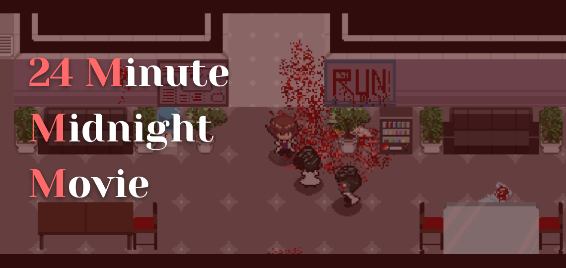
24MMM (24 Minute Midnight Movie) is a pixel-art 2D story-adventure game inspired by midnight B-movies. We took over a previous team’s development work and improved the experience. Through actual playtesting, I found the core problem wasn’t “too few features” but “controls too complex” — the game made heavy use of the right and middle mouse buttons, which was too high a barrier for the target audience (casual players); combined with a lack of tutorial guidance, players lost their patience before they even figured out the controls.
The design decisions I led included: unifying all interactions to the left mouse button, replacing the standalone tutorial screen with tutorial events woven into the story, and designing a “survival guide” information architecture to consolidate scattered game information. These adjustments let players get up to speed faster and focus on exploring the story itself.
Read on for the project details ↓
Project Background
24MMM’s development uses a semester-relay model — each cohort’s team takes over the previous cohort’s work and advances the game to its next stage within one semester. When we took over, the game already had basic character movement, object interaction, and an item system, but there were clear problems in the player experience.
Our team had more than 15 people, spanning UX/UI design, software engineering, visual design, level design, and story design. My responsibility was to design and improve the game’s UX/UI, while also bringing the design into the Godot engine as a UI engineer and collaborating with the development team via GitHub.
Defining the Core Problem, Starting from the Audience’s Characteristics
Before starting on design, I first defined the game’s target audience: casual players, non-action-game players, mostly playing on desktop computers. This definition directly shaped the direction of all subsequent design decisions — what we needed to solve wasn’t “making the game more challenging,” but “letting people who don’t game often get up to speed smoothly too.”
Then I played the previous version repeatedly and distilled two core problems:
Controls too complex. The game made heavy use of the right and even middle mouse button to trigger functions (e.g. you had to right-click an item to use it), which was very unintuitive for casual players used to operating with only the left button, and easy to feel frustrated by.
Lack of tutorial and visual guidance. How to open each menu, how to interact with objects — none of it had enough cues. Players could only fumble around by repeatedly checking the control settings, and most casual players won’t have that patience.
The common root of these two problems: the previous version’s design assumed players were already familiar with the control conventions of this genre, but our target audience was exactly the kind of people who weren’t.
Design Decisions: Lowering the Barrier So Players Can Focus on the Story
1. Unifying all controls to the left button — eliminating the cognitive burden of “guessing which key to press”
This was the most basic but most impactful decision. I changed every operation that required the right or middle mouse button to be done with the left button.
Take the item menu: the old version required a right-click on an item to use it, and the menu itself only displayed icons with no descriptive information about the items. I redesigned the menu, adding an information panel on the right — when the player left-clicks an item, it shows a detailed description and a clear “Use” button. One action accomplishes both “viewing information” and “using the item,” with no need to remember which key maps to which function.
The core logic of this decision: for casual players, the controls themselves shouldn’t be something that needs learning. The more transparent the controls, the more players can put their attention on the game’s content.
2. Adding persistently visible visual guidance to the screen
In the old version, opening the pause menu, item menu, and other functions all relied on remembering keyboard shortcuts — even the common ESC key wasn’t bound. During testing I’d frequently forget how to open a menu or open the wrong one myself, let alone a casual player.
My approach was to design persistent menu buttons in the corners of the screen, each with an icon and a text label for its function, so players could operate without memorizing any shortcuts. In addition, when the player character approaches an interactable object or NPC, a control prompt appears above the character’s head, telling the player “what you can do” and “how to do it.”
This guidance isn’t an add-on tutorial, but an information layer woven into the game screen itself, so players can find a clue to “what to do next” at any moment.
3. Wrapping the tutorial in story events — turning “learning the controls” into “playing the game”
After solving the control complexity, the next problem was: the first time players enter the game, they still need a process of learning the various mechanics. The traditional approach is a standalone tutorial level or tutorial screen, but that often makes players feel bored and eager to skip it.
The solution we proposed was to wrap the tutorial as a series of story events at the start of the game — through dialogue with NPCs, interaction with game objects, and cutscene performances, naturally guiding the player to get familiar with movement, interaction, opening menus, using items, and so on while advancing the story. Players don’t realize they’re “being taught”; they feel they’re “living through the opening of the story.”
This decision required close coordination between the UX team and the story team. We planned together which game mechanics needed to be introduced at which story beat, ensuring the tutorial’s rhythm blended into the story’s rhythm without feeling abrupt.
4. Designing the “survival guide” — using information architecture to consolidate scattered game content
As the levels and story gradually took shape, the story team proposed a large amount of content — character backgrounds, item secrets, quest clues — but this information lacked a unified presentation structure.
My approach was to use the existing menu structure to design an information system called the “survival guide”: the journal menu consolidates character information (including trust relationships with NPCs) and quest progress; the notes menu reveals the story details behind items. Both use clear text layout so players can easily read large amounts of content.
In addition, I merged the old version’s standalone quest menu into the journal and added a quest-prompt box in a corner of the screen, so players always know their current objective while exploring the large map and don’t lose their way.
The way of thinking behind this design is actually the same as the information-architecture planning I later did for SaaS products: first clarify when the user needs what information, then decide where the information should go and how it should be presented.
Cross-functional Collaboration: From Figma to Godot
On this project I played both designer and UI engineer. On the design side, I completed the wireframes in Figma with spec annotations needed to bring them into the game engine, so the visual designer could produce assets matching the pixel-art style accordingly. On the development side, I used the Godot engine with the Dialogue Manager plugin to bring in all the UI elements, and collaborated with other engineers via Git branches.
This “design it myself, implement it myself” experience helped me better understand the gaps that easily arise when handing design off to development, and it influenced how I later communicate with engineers at work — proactively considering the constraints and costs of technical implementation in advance.
Outcomes
- Controls fully simplified: all mouse interactions unified to the left button, paired with HUD buttons and control prompts, so casual players can get up to speed without extra learning
- Tutorial woven into the story: the opening tutorial events let players naturally get familiar with all the game mechanics while advancing the story
- Information architecture consolidated: the survival-guide system unifies the management of character, item, and quest information, paired with a quest-prompt box to guide the direction of exploration
- Handoff documentation prepared: created development documentation for the next cohort’s team to take over, including UI specs, known issues, and suggested development directions
Reflection
This project gave me two far-reaching takeaways.
First, in a large cross-disciplinary team, “design decisions” aren’t only the designer’s business. Designing the tutorial events required the story team to coordinate the rhythm; the survival guide required the level designers to provide the content structure — every UX decision involved the work of other disciplines. This was the first time I experienced the complexity of cross-functional collaboration, and it was also the starting point of my later interest in project management.
Second, playing both designer and engineer gave me a better understanding of the gap between “design and implementation.” While bringing in the UI myself, I found that many designs that looked reasonable in Figma ran into all kinds of constraints in the engine — performance, asset specs, interaction logic. This experience led me, in later work, to proactively consider technical feasibility while designing, rather than finishing an ideal solution and then leaving engineers to figure it out.